In our journey through the rainbow, we’ve explored seven colors, from bright reds and soft yellows to vibrant violets. Now, let’s examine the lovely gradients of peach, pink, and magenta and their impact on us.
Nature dazzles us with a pink contrast of a visiting Zebra butterfly.
Explore light mysteries on the storytelling pages of this website.
All color names or terms represent aspects of the sun’s life-giving energies.
Learn more: Chromotherapy in the spiritual healing arts.
Let’s explore the world of Peach, Pink, and Magenta.
![]()
#1. Light’s dance is the beauty of magic.
 Light creates a captivating dance, where reds shift and scatter to create the appearance of Pink. Similarly, when white light leans towards orange or yellow, it appears peach or pink to pure peach
When light veers towards violet, it transforms into enchanting Magenta. This phenomenon, known as color perception, is a fascinating trick our minds play on us. Science explains that it’s all due to how our eyes and brain interpret different wavelengths of light.
But for now, let’s focus on what we see around us.
For instance, when the passionate reds blend with the brilliance of light, they give birth to the tender hue of rosy Pink. This color, symbolizing purity and love, has the power to evoke feelings of innocence and joy, leaving you uplifted.
![]()
#2. Colors of language and their connection.
 Not long ago, we considered something ‘peachy keen’ to be exceptional and exciting. Descriptive color terms reflect their enduring impact on every spoken language.
In Nature, pink and peach are among the most common flower colors in blooms like roses, hyacinths, tulips, and magnolias. Due to their vibrancy and allure, these colors have unique qualities.
Unsurprisingly, our understanding of language and artistic expression involves words, images, and the frequencies of light. Descriptive words, terms and phrases are frequently inspired by the colors present in our surroundings.
This is why ‘peachy’ can describe a sweet taste and ‘in the pink’ can mean feeling cheerful. These examples illustrate the link between color and language and how sunlight evokes specific emotions.
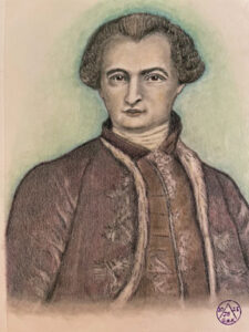
Interestingly, Austrian mystic Rudolf Steiner (1861-1925) concluded from spiritual experiences that peach blossoms represent the living image of the soul.
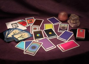
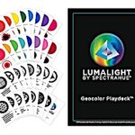
Learn more about Spectrahue’s GeoColor Playdeck.
![]()
#3. Exploring color perception everywhere.

To start, the color wheel consists of twelve colors arranged according to wavelength. Artists and designers use it to understand how colors relate to each other, including primary colors like Red and Blue.
Of course, this includes green shades and Pink or Rose. These colors have distinct characteristics and, when combined, naturally create a refreshing and edible watermelon.
That said, springtime’s white and yellow flowers attract pollinators and soon stimulate the senses with the youthful and fresh appeal of its fruit. Watermelon is a seed-bearing fruit in the vegetable family, along with squash, pumpkin, and cucumber. Its fruit is shielded from the sun by a thick white rind and bitter green skin.
It’s easy to see why pink is associated with sweet flavors like strawberry and raspberry. It adds a playful and artistic touch to whatever it’s associated with. It’s also linked with the exotic and attention-grabbing, like sandy beaches and diamonds that give off a pink/peach glow.
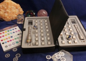
Read more: Lumalight penlights focus on light in Nature.
![]()
#4. Brightly bold colors of healing and creativity.

Visualize a warm, comforting pink light surrounding your aura, focusing on the chakras. This cheerful pink energy can dispel sadness and open your heart to kindness and understanding, facilitating a deep connection with these positive vibrations.
Here’s an intriguing fact: the first artificial dye took its name from the flower “fuchsia.” Later, people renamed it “magenta” in honor of a historic battle.
Magenta symbolizes creativity by actively stimulating the imagination. This color used in art and fashion to shock or draw attention, has a rich history.
Unsurprisingly, in the 1930s, an Italian designer mixed Magenta with white and created ‘shocking pink,’ possibly influencing the vibrant and psychedelic era of the 1960s.
Flowers like clematis and orchids create striking contrasts with their complementary green.
Today, Magenta is often used in advertising and branding to make a bold and eye-catching look. At the same time, Pink is a popular choice for design and fashion, adding a soft touch to any space or outfit.
Read more: The Spectrahue Method for self discovery.
![]()
#5. Radiant forces in the colors in Nature.

Indeed, all colors find their place within the spectrum, coexisting harmoniously as frequencies of light. This beautiful interplay of colors aligns with the principles of the Yin-Yang polarity theory, which suggests that opposing color vibrations strive to find balance. This creates a symphony of light that is both enlightening and awe-inspiring.
This theory views colors as expressions of energy, with each color representing a certain aspect of universal energy balance. In chromotherapy, practitioners regard all colors as equal; none is superior or inferior to another.
In other words, each color has unique attributes, benefits, and uses, along with nutritional factors such as vitamins and minerals, all of which the sun supports in their formulation.
Learn more: What are life path colors?
![]()
#6. The Spectrahue Method is about mystical light.
 In summary, the colors we perceive are creations of the mind in response to light. They result from the way sunlight interacts with and reflects off an object. While the scientific process is much more complex, we delve deeper into these concepts in our virtual classes.
This article embodies the core principles of The Spectrahue Method and Lumalight, reflecting the mission of our website.
Experience more: Light in Time, Red, Orange, Yellow, Green, Sky Blue, Indigo, Violet.
![]()
© 2019 Spectrahue Light & Sound Inc. All rights reserved. No medical claims are made or implied. The opinions expressed are based solely on the author’s viewpoint and studies. This material is for informational purposes only.


